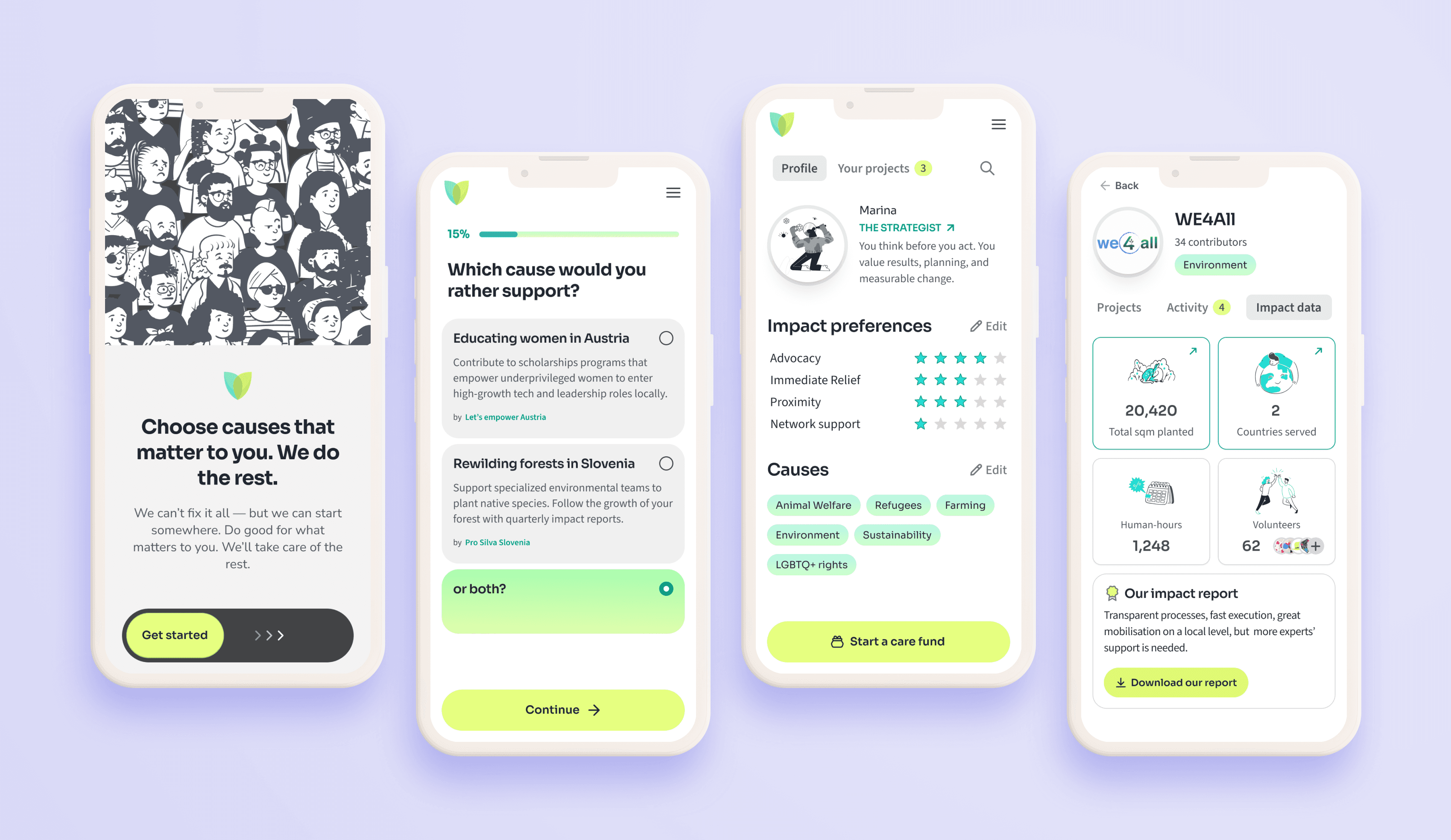
First MLP screens, designed to showcase important product features.
Role
Founding Designer
Year(s)
2025 (3 months)
Duties
Research framing
Product definition
UX Design
Branding
Collaboration with an early-stage startup
I joined ImpactShop (fake name changed for Privacy as the company is currently in stealth mode) right before the company gained its official status as GmbH. ImpactShop has a compelling concept: they aim to create a donation marketplace, where end-users are matched with NGOs, based on their impact preferences and interests and NGOs can present their work and gain additional funds through the platform.
As I joined early on, the real task for me wasn't creating the perfect UX — at least, not yet. It was to define together with the founders which product we wanted to build out of the hundred possible executions of their initial concept. And this was quite a challenge: we had to earn trust as an intermediary from both end-users and NGOs, while designing a truly engaging and user-friendly donation experience.
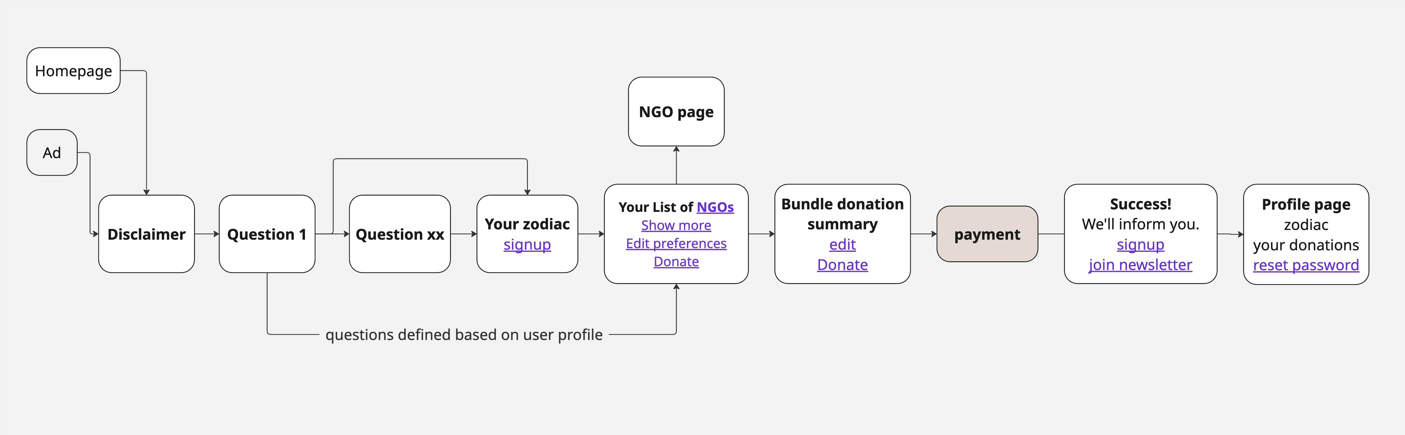
A happy User Flow for the main product (MLP). The flow takes the user all the way from an ad to his profile page. The flow is simplified, omitting error pages, technologies used, emails sent, CTA and content for privacy.
Hypotheses & research framing
At the time I joined, Impact Shop was built on strong intentions but untested assumptions. I led the effort to explicitly surface and structure these assumptions into clear hypotheses clusters:
👩🦱 Target group — Our target users are millennial residents of higher education living in big European and Western cities.
💖 Willingness to donate — eg. Users consider donating and/or actively donate.
🔥 Motivation for donating — eg. Users need to feel trust, in order to donate.
🧩 Problem with current state of affairs — eg. Users have trouble finding how/where to donate.
🧭 Donation preferences — e.g. Users prefer, trust and connect with small NGOs better than with name brands.
🚀 Platform Value — e.g. Users want to be recommended NGOs according to their values.
Formalizing these hypotheses served a dual purpose. Internally, it forced us to confront our biases and different perspectives, especially between the founders, and enabled us to reach a shared understanding of the founders' goals. Externally, it provided the essential framework for our research phase, ensuring every interview and experiment would be designed to test a specific, high-stakes assumption.
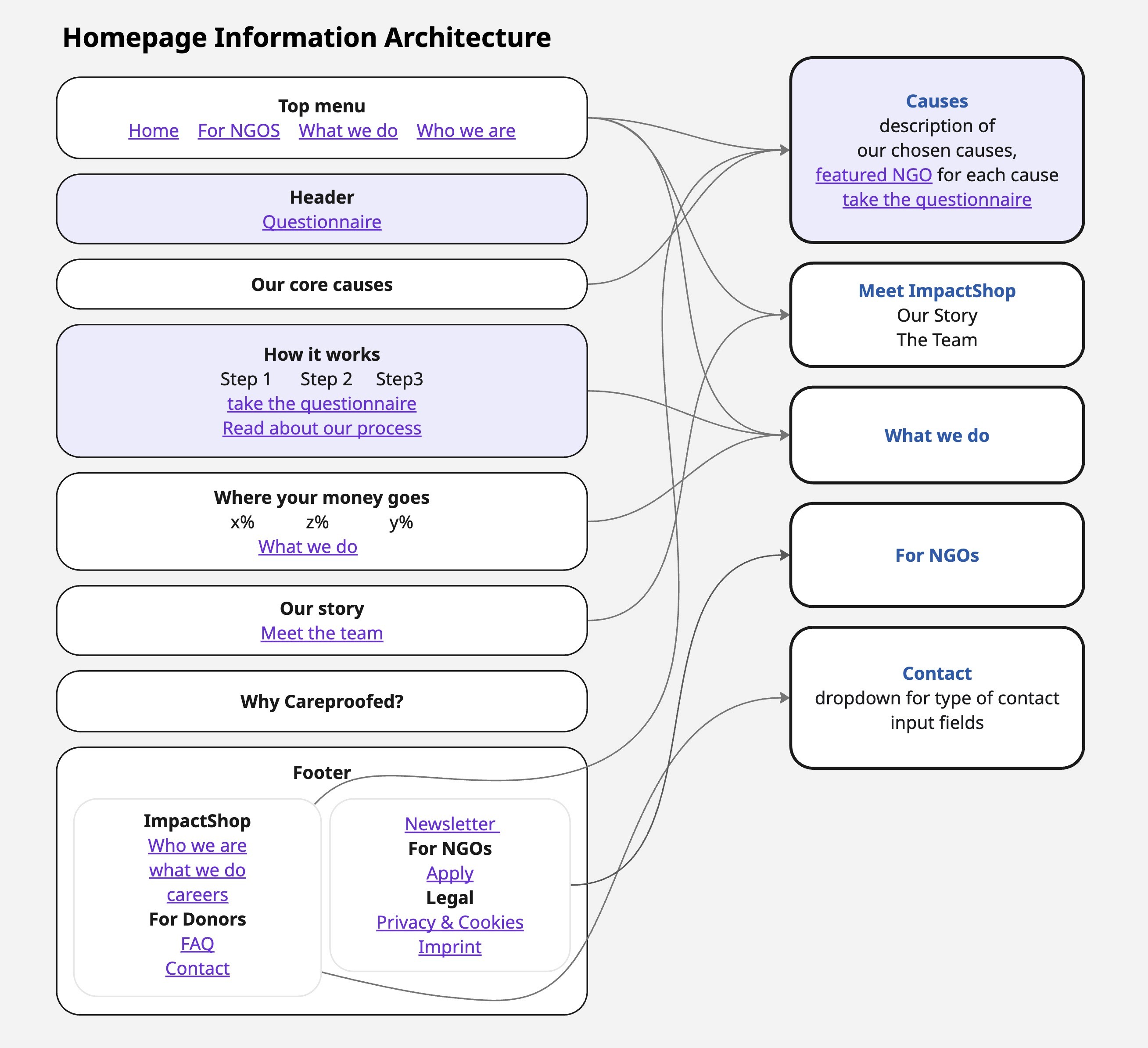
Early-stage homepage information architecture used to align on structure, conversion points, and development scope. The “Questionnaire,” as the main conversion point on the homepage, leads into the MLP flow (see image above).
Rolling Key Screens
Once the core hypotheses were clear and first requirements were gathered, I deliberately started rolling out the first key screens of the product. Each screen design set questions to the founders: what kind of questions shall we ask? how the impact profile of the user is derived? Which causes do we have? How can we create trust? etc. As a designer, this is a thrilling phase because you are the first one to have an overview of all the unsolved issues unravelling right in front of you and you are the first one to propose a temporary answer to them. Feedback from founders was positive and the questions were later brought by the product manager into a several-day product sprint.

A Slide from the Brand Discovery Workshop, focusing on semantics. Are we creating a movement? And is "together" important for our communication?
Brand Discovery Workshop
The initial app screens were delivered with already some branding. I usually prefer not to present wireframes but to create a draft branding scheme for my work from start, in order to help the founders imagine the product and give feedback on all levels. My branding had a clean look and feel and you can see it above. As the founders put emphasis in creating a brand that resonated with them right from start, I designed and led a two-day workshop in order to establish a precise brand core — visual, but also conceptual. The beginning of a project gives a great opportunity to create a bold, crystal clear positioning that is going to create a differentiation advantage in marketing. In this workshop, I aimed to do just that.
Internal Identity Audit: We began by reviewing the company’s predefined Mission, Vision and Values, ensuring the team was aligned. We clarified that while internal values like "Joy" and "Effectiveness" may drive the team’s internal operations, the end-user experience must prioritize feelings of trust, ease (control), and excitement.
User & Competitive Landscape: I led the founders in mapping current donation journeys through the eyes of their target personas to identify their possible troubles and rewards. Additionally, we reviewed competitor positioning.
Narrative & Semantics: One of the most impactful exercises required from the founders to present the product from the perspective of an excited user. This animated the experience founders aimed to bring through the product. We also conducted a deep dive into semantics, debating wording choices like "NGO" vs. "non-profit" to ensure our message was distinct and intentional.
Visual Direction & Archetypes: I asked the founders to collect visual samples into a concrete mood board. While the founders’ "rugged, Berlin-club" aesthetic was a departure from my personal taste, the exercise provided a visual framework for the external logo designer to execute against.
The workshop was impactful on multiple levels: first, it provided the founders a space to surface and resolve key misalignments, strengthening the team's commitment. It allowed the rest of the team to deeply understand the vision and empathize with our end-users, while bringing total clarity to our positioning and the specific wording we use. Ultimately, this allowed us to define the exact end-user experience we wanted to create, so we could begin reverse-engineering it into the product.
Designing with AI
AI was used to accelerate layout prototyping (Figma Make), especially for the marketing page proposal, stress-test UX and product logic (ChatGPT, Gemini), and rapidly generate and refine content variants. Human judgment remained responsible for strategy, prioritization, and final design direction.